Marketers often leave brainstorming for blog page design ideas at the last moment. This blog is for them and every other brand that wants to enhance their main blog page with the right elements.
Blogs have passed the test of time, with 77% of internet users still relying on them for in-depth information.
While businesses typically optimize individual blog posts with proper keywords, meta tags, and alt tags, the bigger picture—your entire blog page layout—often remains under-optimized. Reworking the overall design can boost visibility and user engagement.
This analysis examines proven blog page design strategies that deliver measurable impact for B2B organizations. By optimizing layout, navigation, and content hierarchy, marketers can engage prospects effectively and drive meaningful conversions.
In this blog, I will share some of the best blog page design ideas that work great for brands planning to start or redesign their blogs.
Blog Page Design Ideas With Examples
1. Build and Show Your Goal Statement
A blog page must showcase a clear vision for a brand’s content. A goal statement perfectly sums up what a particular blog channel will focus on and gives visitors a glimpse of what they can expect.
Marketers should create a goal statement for their blog pages. The goal/mission statement should showcase in a simple line what the brand focuses on and what kind of blog posts users can expect. It helps readers understand the overall brand message and makes it easier to filter out relevant traction.
The mission statement for leads should be simple and direct. It should answer two questions: what will the blogs provide, and on what topics?
Example: CoSchedule
For example: Check out the goal statements on CoSchedule blogs.
The goal statement for their content marketing category is:
“Expert knowledge and accountable takeaways in writing, productivity, planning, and organisation.”
It clearly answers:
- What the blogs will share → Expert knowledge and accountable takeaways
- On what topics → Writing, productivity, planning, and organisation

Example: Orbit Media
Orbit Media also sets a great example with its blog mission statement:
“Get practical tips for content marketing, AI, SEO, GA4 and web design”
Another thing to notice in all the examples shared is the placement of the goal statement on the blog page. The goal statement is at the top of the page, mostly present either on the left or at the centre. Brands can choose to highlight their goal statements in whichever way possible, but must always include them above the fold of the blog page.

2. Create Categories
When visiting the blog page, users should be able to access relatable topics quickly. But it won’t matter if categories aren’t intuitive. Adding a data-backed note about user-friendly navigation underscores its critical role in engagement.
Marketing professionals implementing long-term content strategies should anticipate heavier site architecture as blogs accumulate over time. To keep users engaged, use well-organized categories and intuitive navigation, ensuring readers can easily access relevant content.
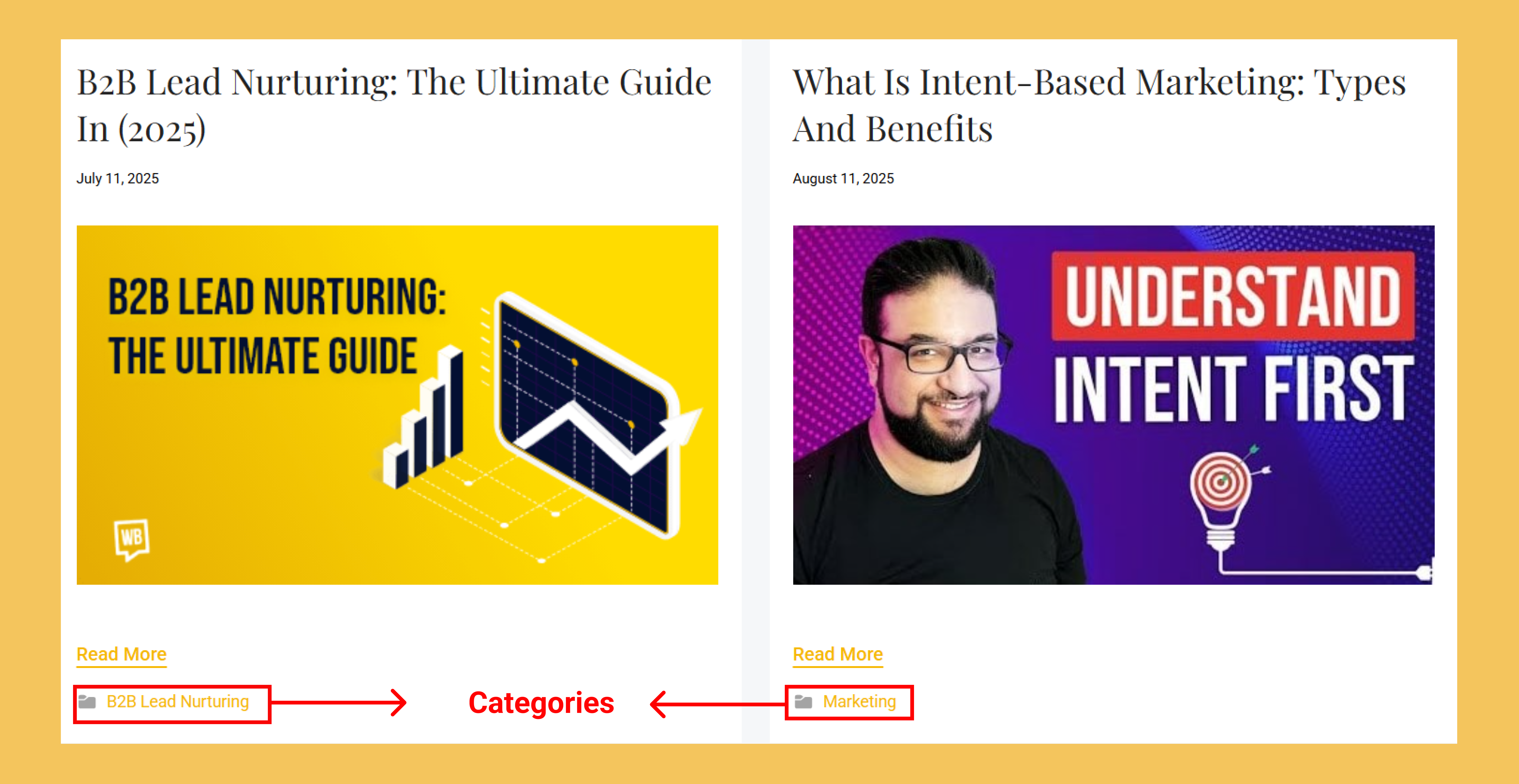
For example, I have a pillar page blog post called B2B Lead Nurturing: The Ultimate Guide. Without categories, a user would need to click multiple pages deep to find it. After adding a “B2B lead nurturing” category, readers can access all relevant content in one place.
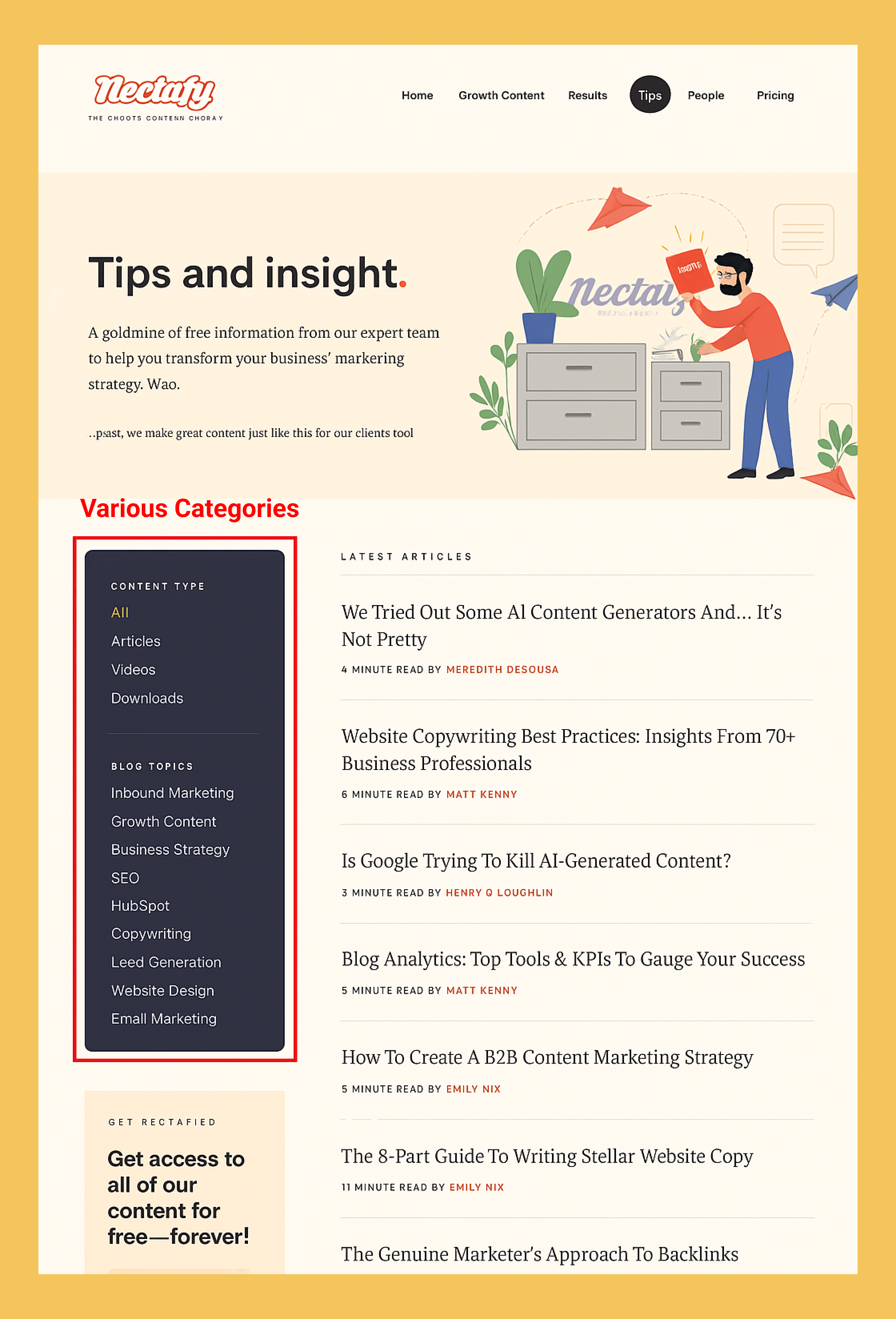
Another blog page design idea for creating categories can be taken from Nectafy. It is a growth content marketing company that has meticulously divided its content into various categories. Visitors can swiftly navigate through different content types and topics without losing a minute. Plus, the placement of the category section as a sidebar adds to the page’s overall design and makes it easily reachable.
Important Suggestion: Download your Blog Catalog Sheet to see how ToFu (Top of the Funnel), MoFu (Middle of the Funnel), and BoFu (Bottom of the Funnel) topics align within each category. Properly defining these terms ensures readers understand your content’s structure and can navigate it effortlessly.
3. Choose the Right Sidebar Elements
Apart from categories, there are other elements bloggers and marketers can place on their sidebar for seamless navigation. Here’s a quick list:
- Search bar with auto-suggest
- Popular/recent posts
- Social media follow buttons
- Quick contact form
For example, HubSpot uses these sidebar elements to guide visitors effectively.
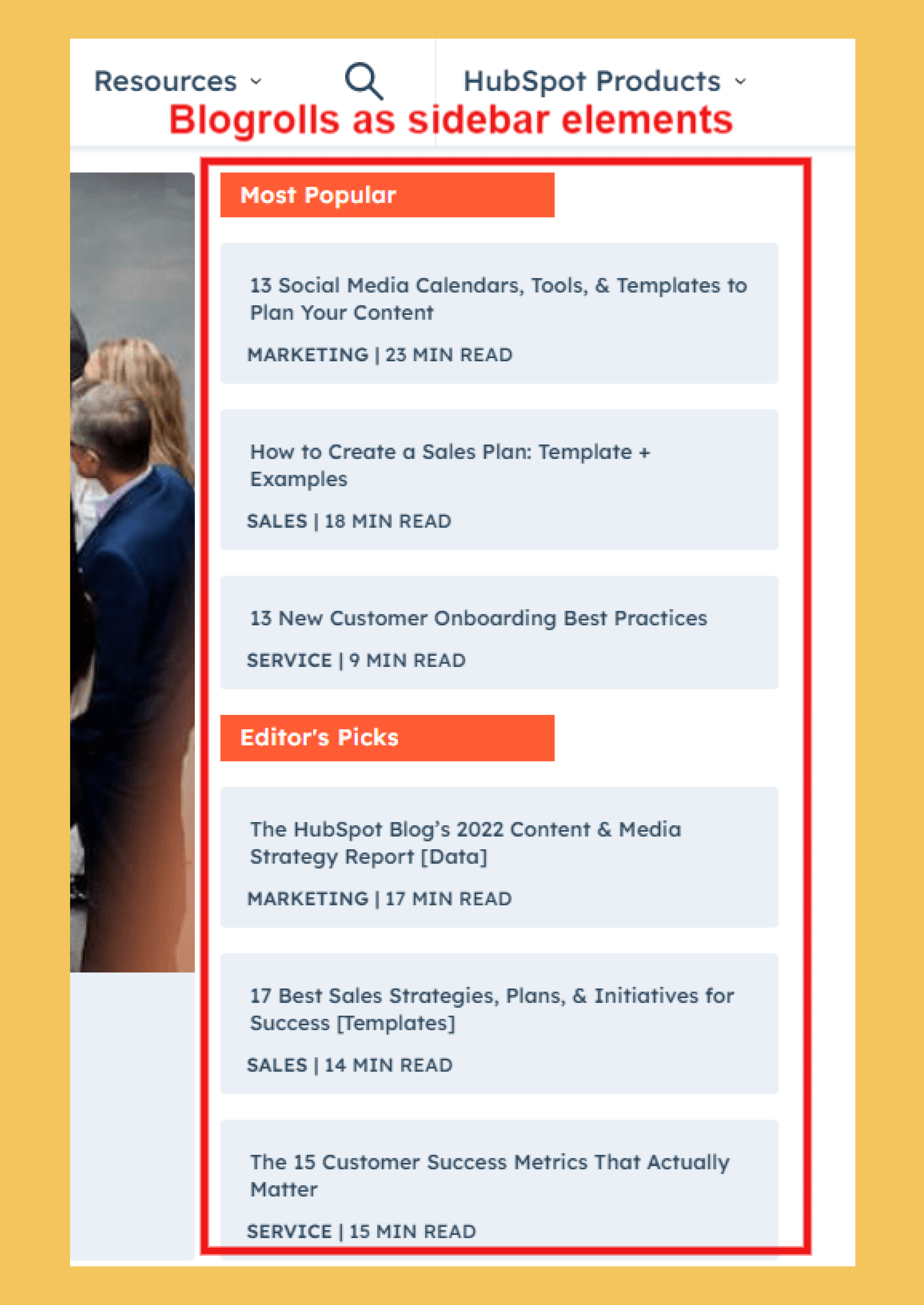
Such blog recommendations help visitors, exploring a brand’s content, get started. It makes it easier for confused users to discover helpful information and leaves a lasting website experience.
A search bar is also useful on the blog page’s side. It helps readers find specific blogs. Related blogs show up when a keyword is entered. On VWO’s blog page, the blog search bar is placed in the center of the page.
4. Design User-Friendly Sign-Up Forms
To maximise a blog page’s value, add an appropriate CTA. This step moves visitors closer to your marketing goal, whether that is subscribing, downloading a resource, or requesting a consultation.
Marketers must align the CTA of their blog page according to their marketing goals. For example, if the goal is to build an email list for nurturing, then a newsletter subscription form or a lead magnet provides the least sign-up friction. There are many creative blog page design ideas in which brands can integrate useful forms with their main blog page. Some of my favourites are:
a. HubSpot is an established brand in marketing automation. It places clear sign-up forms and resource links on its blog to nurture leads effectively.
It is an excellent way to showcase their expertise in various fields while saving users from receiving irrelevant info. The form is present at the middle and bottom of the fold, leaving the top purely for content. Another thing to notice is the mini privacy policy HubSpot has put in the form, which pushes for gaining visitors’ trust.

But what about the visitors who are not interested in newsletters? For them, HubSpot uses a lead magnet. A user must fill out a more detailed form to download the lead magnet.
.png)
We must understand that both forms have the same purpose: to gather consumer info. But each leverages different offers to achieve this goal. HubSpot has placed the forms on the blog page in a way that does not disturb the user experience and complements the overall page design.

b. BrokerLink is a company that makes buying insurance easier. Instead of crowding their blog page with a form, they have placed a simple CTA button on the sideline. When clicked, a pop-up form appears with a form field.

5. Add Extra Touches For Great UX
Great user experience isn’t only about aesthetics—it shapes how readers perceive and engage with your content. By focusing on structure, navigation, and content clarity, brands create a supportive environment that converts readers into leads.
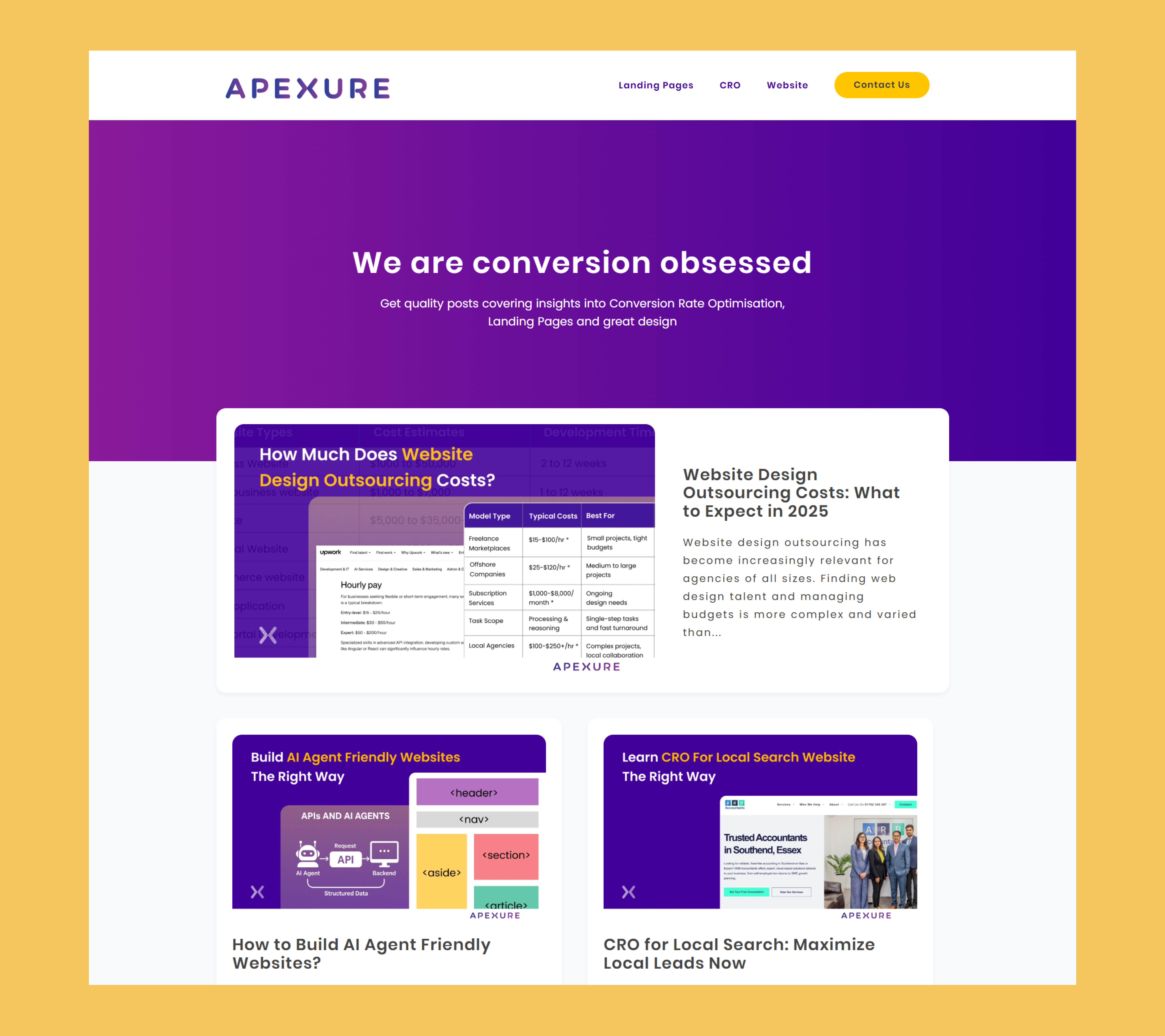
Using every texture and space on the blog page as a value-adding element is crucial. On Apexure, a leading landing page and CRO agency, the main blog page has nice, clear fonts with a featured image for every blog supporting the headline. The design for every image remains consistent, providing a clean look to the page.
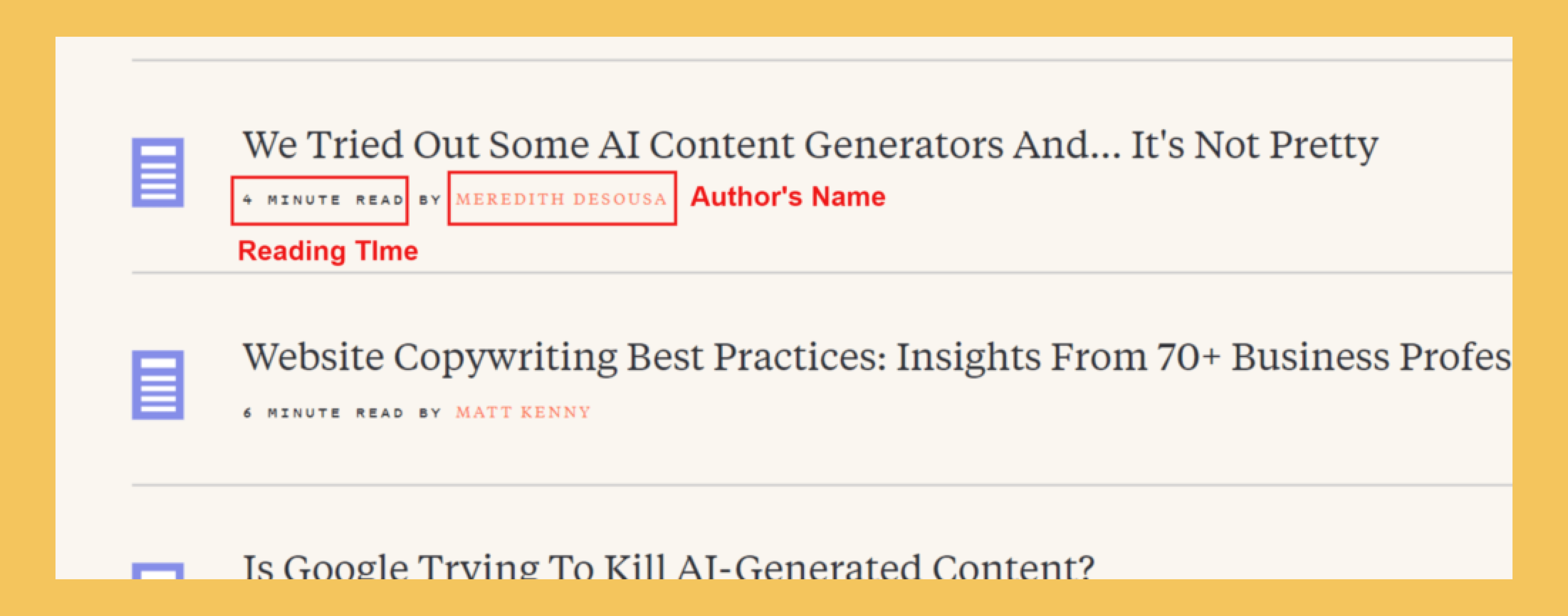
Other elements that have recently become popular include showcasing reading time for a blog post. It can help readers determine how long a blog post is without opening it, and it boosts transparency. Putting the author’s name on the main blog posts projects that the article comes from a person, not just a brand. It opens up space for conversation.
Research from Nielsen Norman Group shows that including estimated reading time improves user satisfaction and transparency, helping readers decide whether to engage with content.
FAQs About Blog Page Design
1. How do I design my blog page?
Start with a clear structure:
- Add a goal statement at the top to set expectations
- Organize content with categories and menus
- Use a sidebar with only helpful elements
- Include sign-up forms or CTAs that align with marketing goals
- Test and iterate based on bounce rate, scroll depth, and sign-up conversions
2. How should a blog page look?
A good blog page balances visual appeal with usability. At a glance, it should:
- Be clean and consistent with your brand style
- Highlight featured images for each post
- Use white space for readability
- Offer easy navigation (categories, search bar, sidebar)
- Provide calls to action without cluttering the page
3. What should I put in my blog sidebar?
Choose only items that help visitors find content or connect with you:
- Category list or tags
- Search bar
- Popular/recent posts
- Email sign-up or lead magnet button
- Social-media follow links
- Recent comments or short testimonials
4. How should I design sign-up forms on my blog page?
Follow four simple rules:
- Keep it short: Ask for the minimum—often just an email
- Show clear value: Use a benefit-driven headline and button text
- Place it wisely: Mid-article, end of page, or as a light sidebar/popup
- Build trust: Add a privacy note and, if relevant, a lead magnet offer
Design Your Blog Page Today
With these blog page design ideas, brands can build main blog pages that showcase a customer-driven interface. Crafting a web page that showcases what all a brand is ready to share for free with its prospects is not an easy job. It needs to be well-organised and coherent with the brand’s design value.
Elements like reading time, categorisation, forms, etc., act as assets and gives users the options to explore and interact with the page more. From reading options to recommendations, a blog category page can become a playground to amuse and attract audiences. Don’t sleep on it. Start designing or redesigning your main blog page the right way with the shared ideas today.
Related Articles:
Why is Blog Writing Important for Business Growth
The B2B Blogging Strategy Every Beginner Must Know
How to Promote Your Blog: 4 Best Blog Promotion Strategies
How to Improve B2B Website Conversions: Effective Strategies

%20(1).webp)
