Blog design is often overlooked because most of the focus goes into producing fresh and original content. But great words are not enough.
A well-designed blog improves readability, increases trust, and encourages visitors to take action. Even strong content can fail if the layout is cluttered, fonts are inconsistent, or navigation feels confusing.
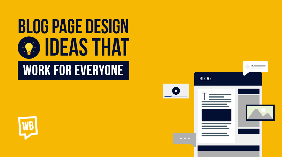
This guide explains 12 proven blog design best practices backed by research and examples. Each section includes actionable steps you can apply immediately.
Table of contents:
- 12 Blog Design Best Practices For Better Ideas
- . Width of the Blog Post
- Size of Blog Post Images
- All About Fonts and Typography
- Does Blog Format Matters?
- Show Table of Contents
- What To Put At the End
- Write about the Author
- The Takeaway Image
- Include Published and Last Updated Dates
- Putting Banners and Pop-ups
- Having Share Buttons
- Adding Elements
- Importance of Following Blog Design Best Practices
- Design the Best Blog Post Layout
- essential aspect of scaling a business
1. Ideal Blog Post Width
A blog post is already a content-heavy web page. It becomes essential to create appropriate breathing space for the page’s elements by incorporating white space. Leaving empty spaces on the side of the blogs gives them a clean and simple look, ensuring the blog article layout is easy to navigate.
But how wide should be the width of the text be?
Brands use various text widths, but they all lie in the range of 600–700px wide. By utilising white space effectively, the text can be made more readable and easier to digest for the reader.
Here is an Orbit Media example with a 635 px width and ample white space. Also, notice how the images align to the text width. Together, these choices create a uniform look. They also keep the reader focused.

The presence of whitespace in the blog post also allows marketers to insert helpful navigational elements on the side.
For example, Mailchimp has integrated a small feedback form with its blog pages without disturbing the reading experience. While Orbit Media includes sticky social media share buttons on the side of the post to prompt a quick share on social media by the blog readers.

2. Consistent Blog Image Size
Consistency in image sizing is one of the core blog design best practices. Blog article image size should always match the width of your content area to avoid layout shifts and blurry visuals.
Recommended blog image sizes:
- Standard blog content image:
Match your image width to your blog content width.
Example: If your blog post width is 635px, your image width should also be 635px. - Image height:
There’s no fixed rule. The height can vary based on the content, but a 2:1 or 16:9 ratio works best for readability. - Featured image (common CMS standard):
1200 × 630 px – ideal for social sharing and responsive layouts. - High-resolution (retina-ready) images:
Upload images at 2× the display width (e.g., 1270px for a 635px layout) and let CSS scale them down. This keeps images sharp on high-density screens. - File format & optimization:
Use WebP or JPEG for photos, PNG for graphics with transparency, and always compress images to keep file sizes under 150–200 KB.
Following these image sizing guidelines ensures faster load times, consistent layouts, and a better reading experience across devices.

3. All About Fonts and Typography
The main focus while choosing a font should be its legibility. No matter how fancy a font looks, if it disrupts the reading flow, it’s a no-go. Readability should always take priority over aesthetic appeal.
Two things to remember while deciding on fonts are:
i) Font Size
Though 10px or 11px is the resorted font size, whether it’s on docs or spreadsheets, it should not be the same for a blog post. The font size on blog posts must create a visual hierarchy and support the page’s structure.

Use this table to pick font sizes for blog posts. It lists recommended sizes for large screens, such as laptops and tablets. It also covers small screens like mobile phones.
| Content-Type | Font Size For Big Screens | Font Size For Small Screens |
| Headings (H2) | Between 54 to 30 px | Between 18 to 10 px |
| Sub-Headings (H3) | Between 39 to 30 px | Between 13 to 10 px |
| Paragraphs | Between 24 to 18 px | Between 8 to 6 px |
ii) Font Type
Font type is crucial for first impressions. Every word should be easily legible to the visitor. Basic fonts like Arial, Time New Roman, Sans, etc., will be better than using fonts like Comic Sans, which look fun only on greeting cards.
There is no standard font type, but brands can always analyze top-performing domains in their industry to know which font will suit them better. Just follow the rule of keeping it simple. Marketers can use tools like WhatFont to conduct such font analysis easily. Choosing the right font is an essential aspect of blog design best practices.
4. Use Correct Blog Format
An organized blog post makes it easier for readers to scan and find information quickly. It also helps with SEO, as a clear blog page structure allows search engine crawlers to better understand your content hierarchy.
Formatting tips:
- Main blog title: H1 (only one per page)
- Headings: H2
- Subheadings: H3, H4 (as needed)
- Paragraph length: Keep paragraphs to 3 to 4 lines max for better readability
- Images: Visually separated from text with enough spacing or outlines to make them stand out
For example, this is how I format Waseem Bashir’s blogs:

Try to keep the paragraphs limited to four lines as it becomes easier for the visitors to read and outline the images to make them stand out. Here’s a clean blog format example:

5. Add Table of Contents
A table of contents (TOC) is one of the best navigational aids. It helps readers jump to relevant sections. While not necessary for short blogs, it’s vital for long-form guides or pillar content. Mailchimp utilises something similar.

6. What To Include At the End
The end of a blog post is a great space to give actionable cues to visitors. Brands have a lot of options when it comes to deciding what they want their prospects to do next.
Here, marketers have four options:
i) Related blog posts: Having a section at the end of the blog posts where related posts are recommended can further enhance the visitor’s research journey. It not only extends the time prospects spend on your blogs but also showcases how extensively you have covered a topic.

ii) Lead Magnets: Adding a lead magnet at the end of a blog post is effective. It capitalizes on the reader’s interest to boost conversions and grow your audience.

iii) Newsletter Sign-up: Placing a newsletter sign-up form at the end of the blog post aims to capture interested readers, helping to build your subscriber list and maintain engagement.

The right end depends on a blog post’s position in the sales funnel. For example, if the blog post is present at the top of the funnel, then a related blog post or newsletter sign-up is an appropriate ending for it.
Similarly, lead magnets work well with a middle of the funnel blog post but can also be used with ToFu blogs. Services pages are best for bottom of the funnel blogs.
Consider using our Blog Catalog Sheet to streamline content management and enhance your blog strategy. This tool simplifies tracking Calls to Action (CTAs) and helps identify the perfect stage in the buyer’s journey for each post, whether it’s at the ToFu, MoFu, or BoFu. It’s a valuable resource for optimizing your content approach and aligns with blog design best practices.